Pikok
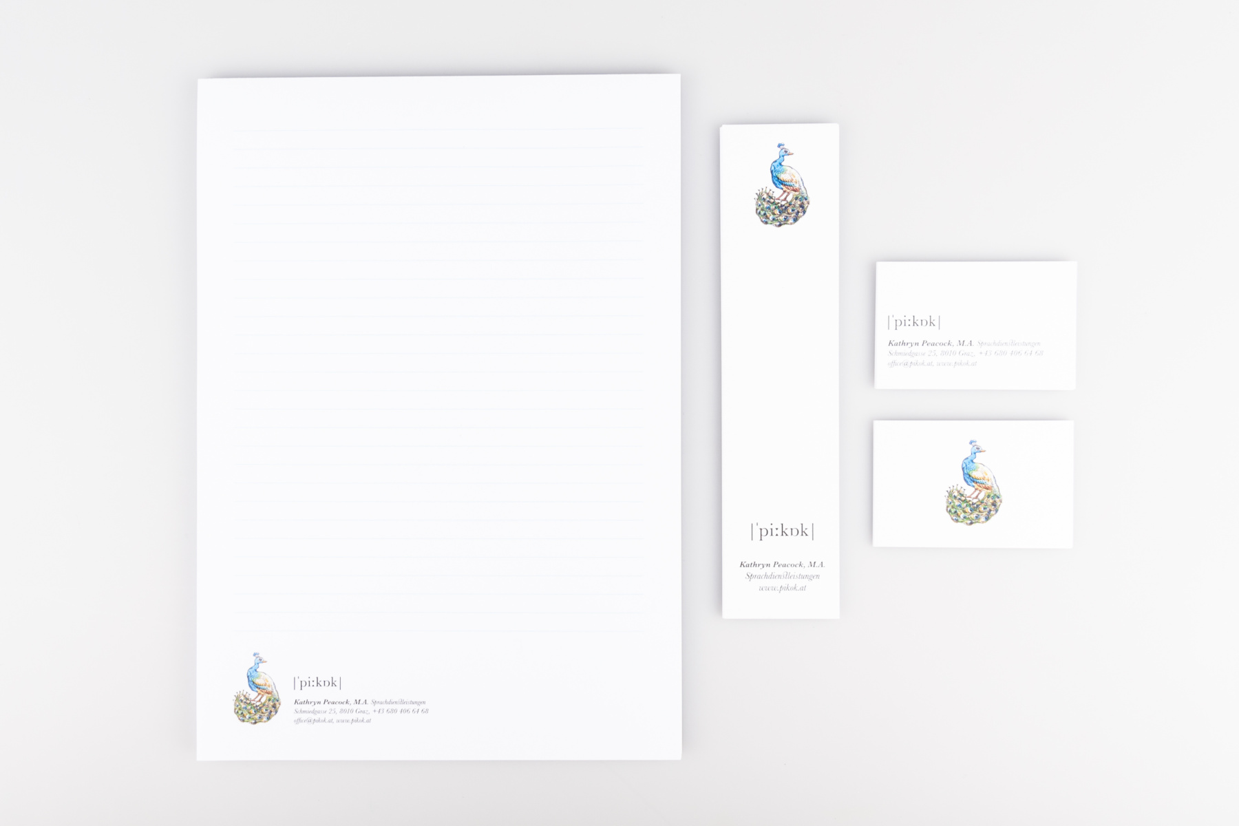
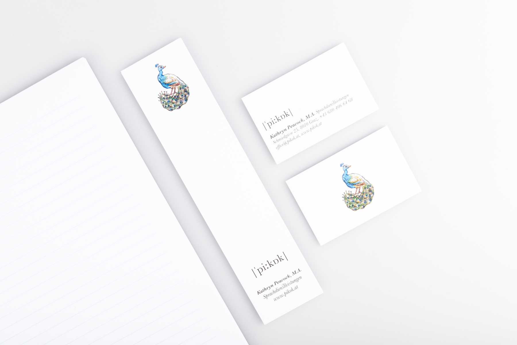
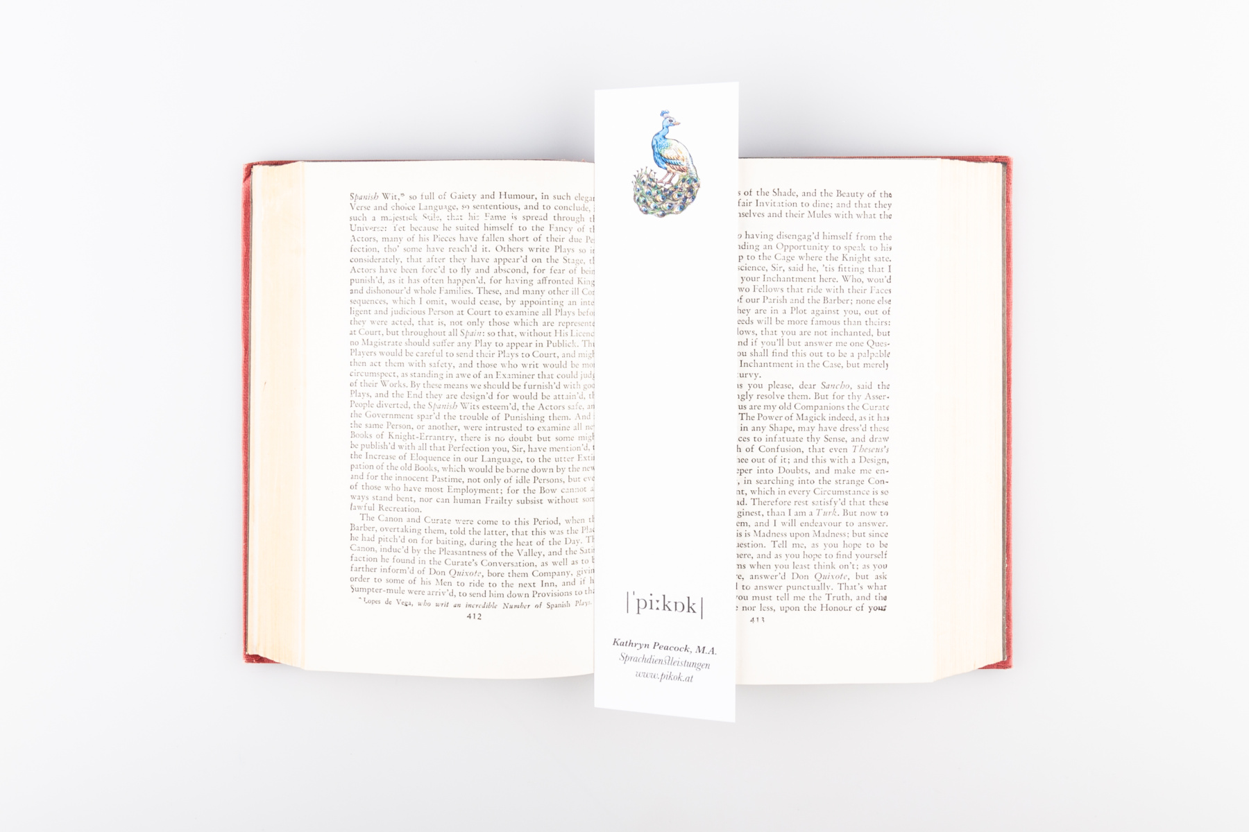
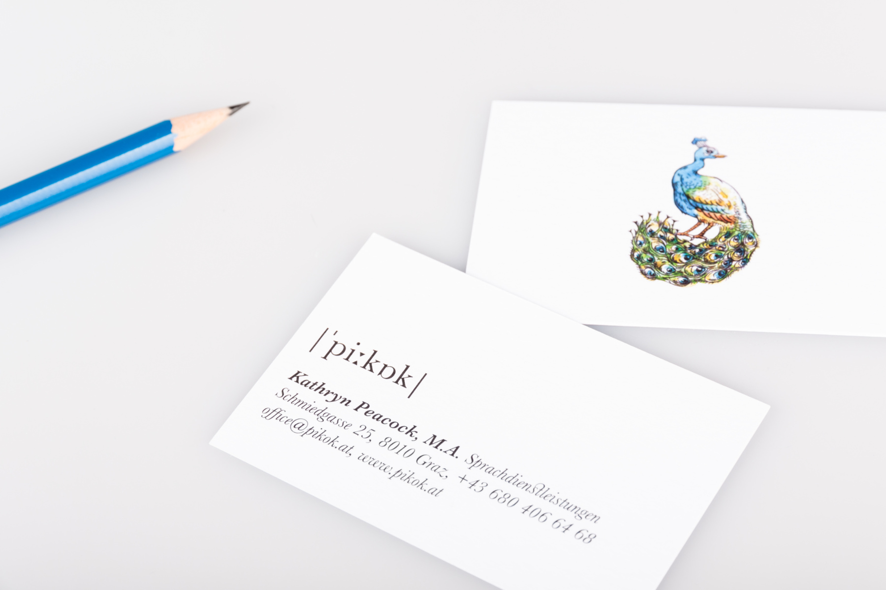
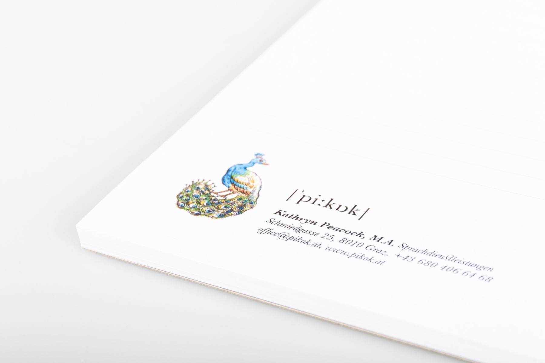
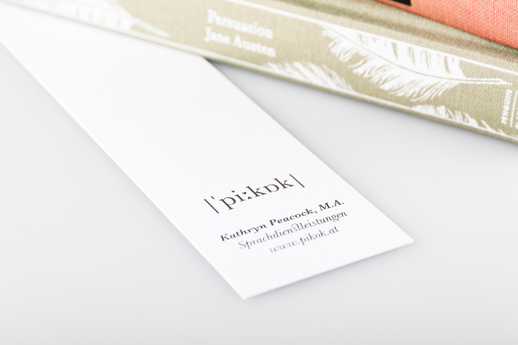
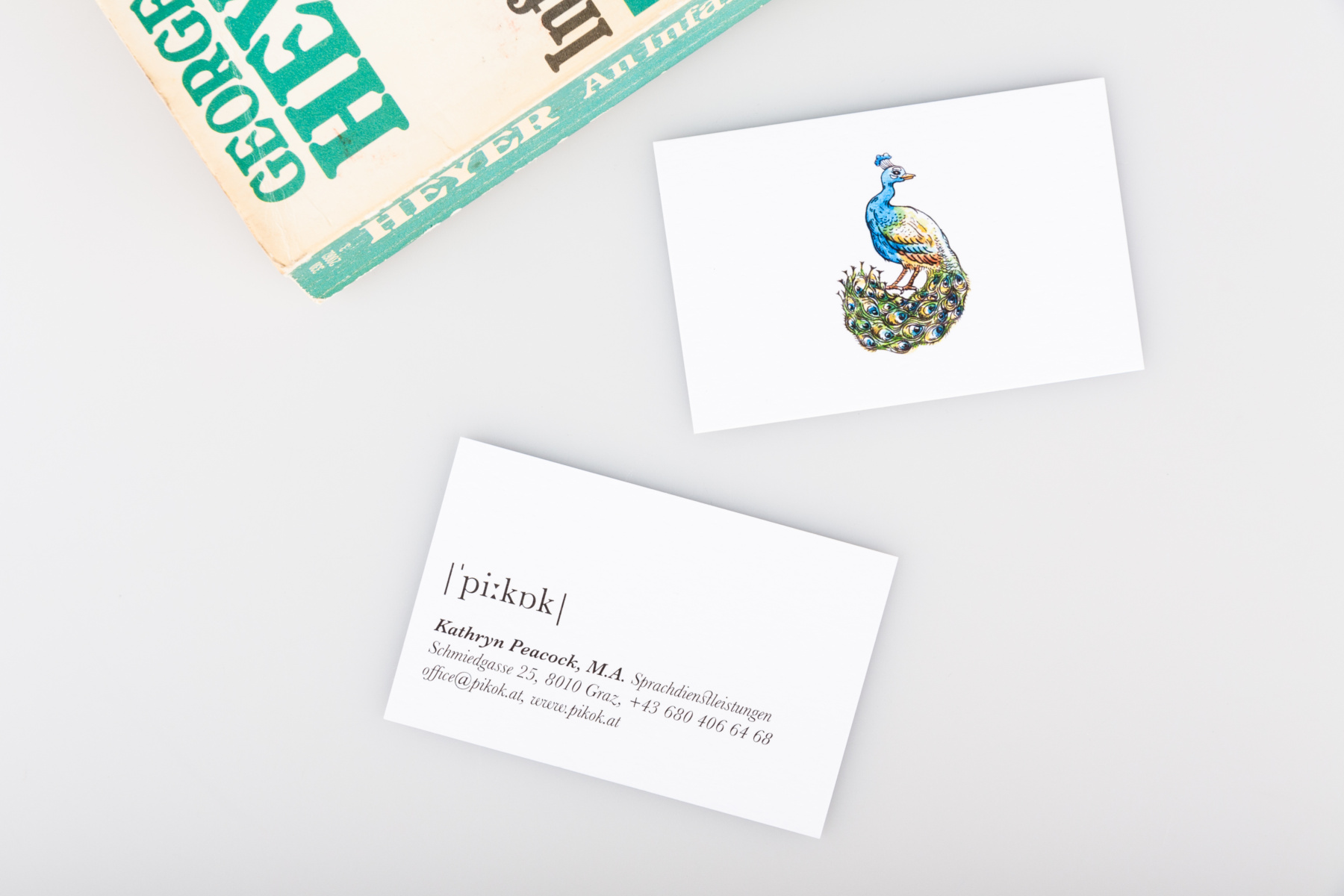
Brand design for Pikok Language Services. As a language consulting business, books and letters are close to the heart of this company, which is why inspiration for its identity was drawn from the visual style of a dictionary. For this purpose, a word mark using the International Phonetic Alphabet was chosen, and set in Baskerville for its echoes of the printing press. Business cards and notepads were designed and produced, in addition to bookmarks, to be used as promotional material.
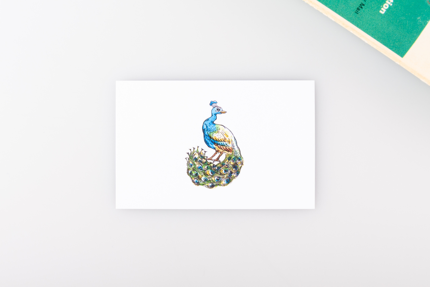
The Pikok logo features an illustration by Marion Kamper.
