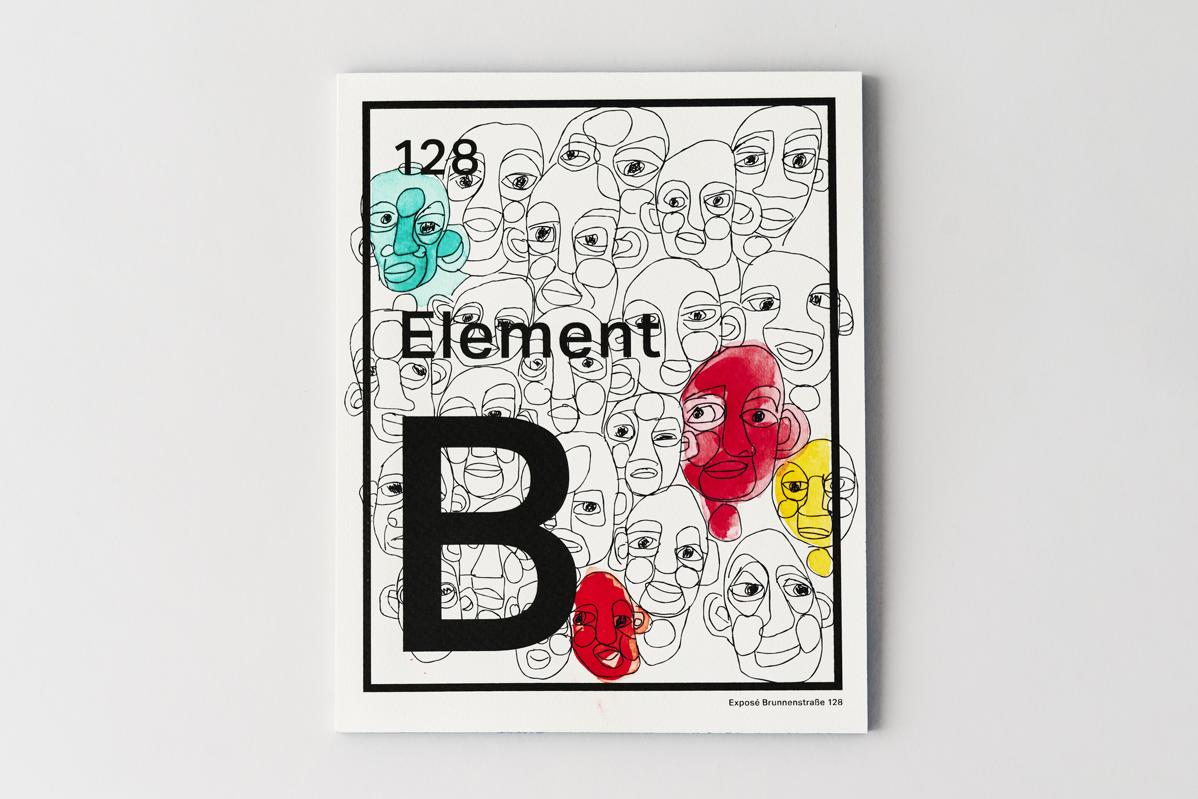
Element B
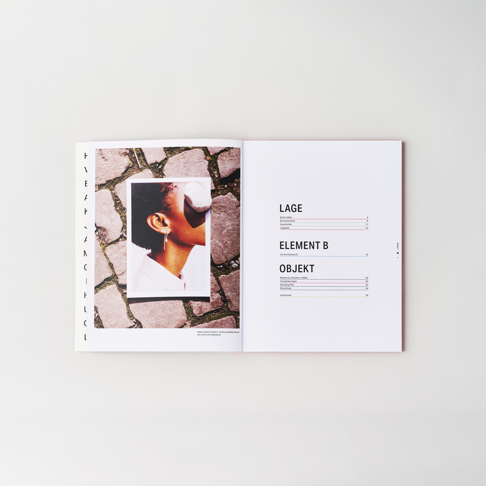
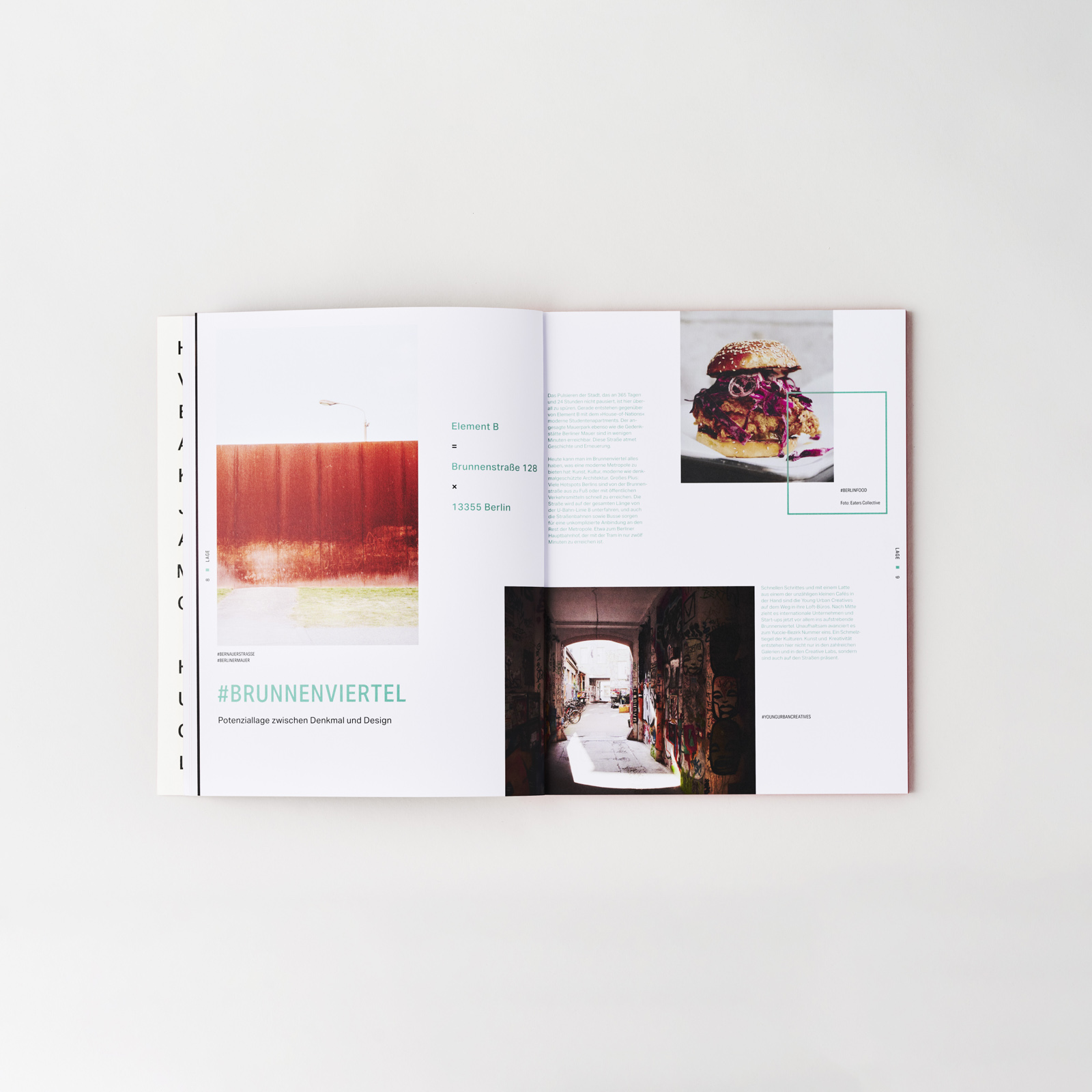
The branding for the office development project Element B distills the essence of its location on Brunnenstraße, within Berlin’s culturally diverse Brunnenviertel district. True to its name, the design draws inspiration from the periodic table.
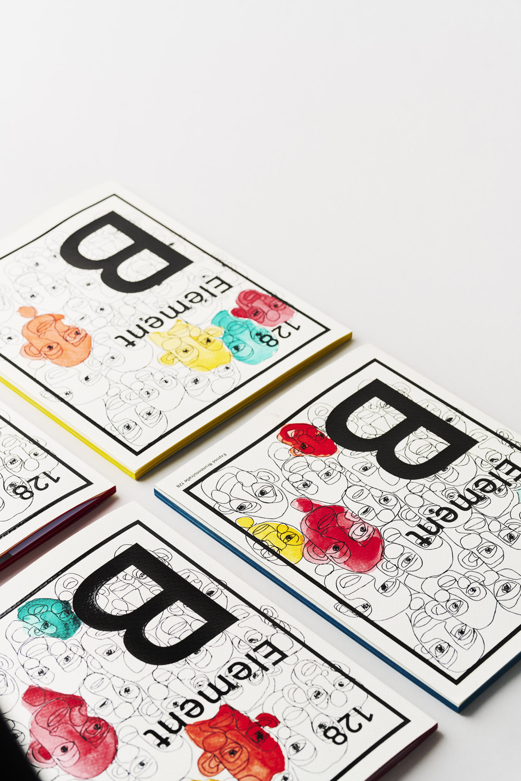
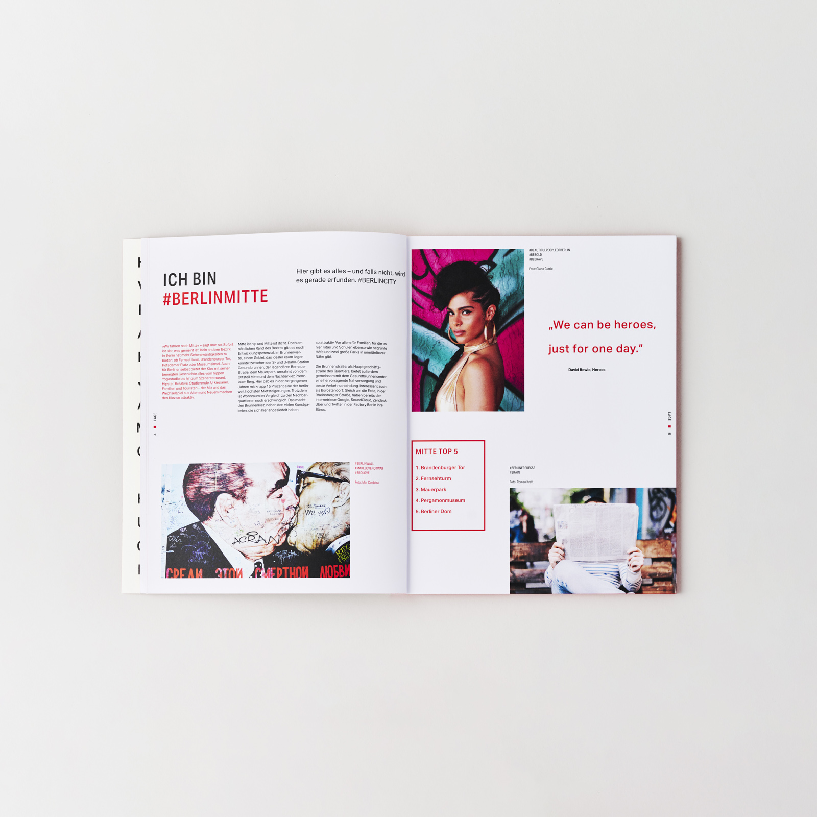
The brochure celebrates Berlin’s diversity through a rich palette of colours and bold typography. The city’s artistic spirit is also captured on the book’s cover: Each of the heads, which are based on graffiti found in Berlin, is individually painted with watercolour. Additionally, the brochure features four variations of coloured edges.
The project was completed with and for Freiland Konzept GmbH. The pictures were taken by Valerie Maltseva.